Hi Everyone,
I am so very excited today to be bringing you my Guest Design piece for
A Vintage Journey. Thank you so much to Nikki, Brenda and the team for asking me back again.
Their latest challenge 'Stencil It' is hosted by
Amanda and as the name suggests is all about Stencils this is how she describes
The Challenge.
There are so many fantastic stencils available to us right now and so many ways in which to use them we would like you to include some stenciling in whatever it is you choose to create for this challenge. Don't forget inks, sprays, paints, texture/embossing pastes and gesso are all stencil friendly so be sure to have fun and embrace your stencils in your vintage, shabby, mixed media, art journaling, industrial or steampunk projects.
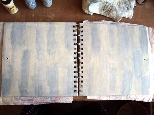
Well I just love stencils and so had plenty to choose from for this project. I decided that it was high time my Wanderlust journal got a makeover as it was just a plain Kraft card cover so I got to work with my stencils, paints and paste and this is the result.
My front cover above features the wonderful Mr Umbrella Man, I decided to used him as he looks like he is looking towards the book opening and wondering what lies beneath the cover. The colour combinations of both the front and the back (below) came together quite by accident as I started off with a blue theme but I am really pleased that I threw a few contrasts colours in there.
First step Gesso the cover, dry and brush stroke with Weathered Wood & Stormy Sky paints
Use Stormy sky through the Rays stencil
Use Peacock Feathers through the Latticework stencil
Use Antique Linen through the Stripes Stencil
Wash the edges with DecoArt Green Gold
Dab Gesso through the Doily stencil around the edges
Use DecoArt Crackle paste through a mini stencil (this one is from set 12)
Use black soot through bubble stencil plus Peacock feathers through schoolhouse and Salty ocean through another mini stencil. You will notice I also added more crackle paste as before.
Spritz spiced marmalade around the centre and salty ocean around the edges.
Use Wendy Vecchi Black embossing paste through the splatters stencil
Add more colour with a wash of salty ocean down some of the embossed stripes and a wash of DecoArt Quinacridone gold (You may notice I used a white pen on some of the black bubbles which I decided I did not like so removed with a baby wipe)
This piece of stenciled card had been hanging around from another project since the year dot. It was just several colours of paint brayered with white embossed stencilling.
I simply tore it into strips and used it to make Mr Umbrella Man pop out of the journal. To make the cover more hard waring and to protect the Artwork, I gave it a good coat of Rock Candy Crackle Glaze. The crackle glaze not only protected it but it also gave me chance to get more colour in to the tiny crackles and so add even more interest.
This lay on my desk for a few days and I was sorting out my ribbon drawer, some of which again I had not used for ages and I thought Hmm! I wonder if...So The spine got well and truly dressed with all sorts of ribbons, makes is look pretty I think, aI love the way you can still see all the stages of the stencilled layers


There is still plenty of time to join in
The Challenge so get out those stencils and have a play.
For more photos of my finished journal cover pop over to
A Vintage Journey
Mo x


 I spritzed and flicked with water and distressed the edges before inking them up with DI
 Using the trellis Frameworks die and grunge paper, I painted the frame with Picket Fence, sanded it back and inked it up again.
 The inner parts of the trellis were a mix of corrugated card, canvas, and brayered and embossed grunge paper.
  The butterfly was made up of two die cuts, the one underneath was cut in half and pulled out slightly so you could see the deeper colours underneath.
 A few pearls, inked vintage ribbon bow and rub ons completed the look
 The rub on butterfly looked a little dark when I put it on to the tag, so I simply lightened it up with a few white pen strokes

 The butterfly antennae are painted flower stamen