Monday 29 February 2016

Wanderlust catch up and new Craft Storage

Hi Everyone

Apologies to all as I have been AWOL again for a week or two, but you will be pleased to know I have not been sitting around doing nothing.  I have been falling behind a little with my Wanderlust pages and projects so I thought it was about time I knuckled down and did some catching up.  The pages below came from a prompt we were given write fast, furious and cover the page.


The pages started with a coat of Gesso and texture paste through a new paperartsy stencil by Sara Neumann followed by  a wash of some of the newest distress colours.

 
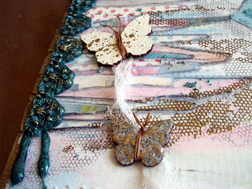
As you can see I have very small writing which is usually quite neat, but with writing fast over the uneven Gesso it looks very messy, cue the ink splats with one of my Indigo blu stamps to make it even messier!


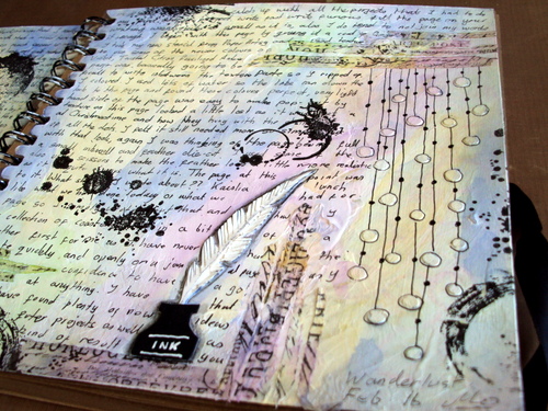
Still keeping with the writing theme, I added a die cut ink pot and feather quill, not sure why I wrote ink on the pot as it it fairly obvious what it is!!?? 
The picture below shows the texture through one of the patterns of the stencil which was just dots and looked a little lost on the page so I linked them up and penned around each one.


The page was finished with a few torn strips of tissue tape.
 
 
I still have at least 2 projects to complete before I have caught up with the Wanderlust journey so I will be working on those this week.  I would have finished these too had I not been busy with another project which involved a tidy up of my craft room.  I am lucky enough to  own a beautiful drawer unit made by my Dad many years ago which holds all my card/paper/stencils etc, see picture below.  
  
 
  For a long time now I  have wanted a shelf unit to hold all my paints/stains/mediums etc. so I asked a local carpenter if he could make me one to fit the desk.  I took delivery of this last week and took a couple of days staining it to match the drawer unit.  I am so pleased with the result and  wanted to share it with you.
  
 
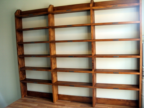
If you zoom in you will see that I have used inspirational word bands to decorate each shelf


I have already started to fill it up, with some of my stash as you can see below, the top shelf is perfect for displaying projects already completed.


  Look at that tidy desk, I don't think it will stay like this for long! I have just got to sort out my die cutting area out now which is on the other side of the room and I should be organised.
Thank you for your visit, have a good day.
Mo x


Monday 15 February 2016

February Tag

Hello all you lovely people, thank you for dropping by.

Tim's February tag is a technique remix of stenciled Monoprint and  Embossed Texture Paste, you can see all the steps from the master himself Here and below is my take.


I started by using the monoprint technique with the dot fade stencil and frayed burlap distress ink straight on to a tag.  I then used Stormy Sky and Faded Jeans through the bubbles and the stripes stencils to add layers.  The edges were distressed and inked with Chipped Sapphire.


I chose the eye chart stencil to use for my texture paste for no other reason than it was the only stencil of Tim's that I owned that I had never used.  The texture paste was sprinkled with Pumice Stone distress embossing powder. 
 

The photo is one of my friends when she was 18,  I love the way it just Captures the moment.  The year was 1960 a time when more people were able to afford a family car and were enjoying day trips.  Ladies were finding they had more time away from the household chores due to new time saving gadgets like hoovers and washing machines. With this in mind I decided the chit chat 'Freedom' word was a good word to sum up the mood in the photo and the era. I used a journalling ticket for the frame of the photo, cutting out the centre and using my crop-a-dile to punch extra holes so as to  make it look like film strip.  


I used Stormy Sky distress marker and Tim's photo tinting technique to make the car blue, not sure if it was blue originally but I think it makes the photo more interesting.


As you can see from the background I have just taken delivery of the lovely new Dapper 12 x 12 paper pad so I am going to have some fun playing with this in the next few weeks, watch this space!
Bye for now
Mo xx


Saturday 13 February 2016

Spring Canvas (Part 2)

Hi Everyone,

Welcome back for part 2 of my Spring Canvas Click here for Part 1 which shows you how I made up the background.  After a little more playing and tweaking and adding of bits and pieces from my stash now looks like this...


The little wooden butterflies were part of a wonderful thank you gift of die-cuts and wood parts I received from Julie last year.  The butterflies have been covered with three different colours of Stampendous embossing enamel and had rusty look wire wrapped around them for bodies and antenna. I then gave them a cheesecloth butterfly  trail. 


Here you can see a close up of the UTEE dribbles and a few seed beads to continue them down the canvas

This lovely wooden tree was a bargain purchase from The Works a couple of years ago, I can't believe I haven't used it until now.  I decided to keep it natural so I could still see the colours underneath, however I wanted also to give it some lift and added texture.  I had a little play and settled for the wire I had used on the butterflies wrapped around the tree and a layer of cheesecloth underneath.  The flowers started life as a broken down cheap necklace I found in a charity shop, I used the blue embossing enamel to colour them  and then used tiny watch parts for the centre.  The owl was originally silver and I used treasure gold to colour him to match.
  
Last week I managed to purchase an Olympia typewriter for £5 and all it need was a new ribbon.  A quick look on the Internet and I found a shop that supplies all types of Typewriter ribbons, I gave them a call and had my ribbon the next day! that's service for you.  The wording was copied from my dictionary   with the typewriter and added to another piece of matching paper.  The buttons were already in the paper design. 

This little Peacock was one I got when I did attended a workshop with Hels Sheriden a couple of years ago,  I used one on that Canvas too, you can see my post for that one HERE.  The Peacock was easy to bend so I could make it sit on the moulding. 


I brought the Cheesecloth under the Peacock to tie it in a little with its background.


 A few more seed beads and embossed dribbles at the base of the tree


And a final look at the completed Canvas which is now displayed on my Craft room wall, it makes me smile when I look at it, I hope you enjoyed seeing it too.


Thank you for dropping by today, Happy Crafting everyone 

Mo x


Friday 12 February 2016

Spring Canvas ( Part 1)

Hello everyone,

Thank you so much for taking the time to drop by .  I have been working on a canvas this week that was one of those projects that I had to do a little walk away and come back to whilst I thought of where it was going.  Unusually for once I remembered to take photos along the way so this has enabled me to show you the step by step of how I put it together.  This post is part one  where I show you the make up, and on my next post you can see the finished canvas and close ups, hope you enjoy.

Spread texture paste through doily stencil over various areas of the canvas


Dribble Victorian Velvet distress stain down from each short edge of the canvas towards the centre and spritz water to help it run down more
dab off with a paper towel if it starts going to far.  Continue until you are happy
 
 
Add Peacock distress stain to some textures areas, again add water to disperse the colour more
 
 
Finally add Peeled Green distress stain
 
 
Tear some scrap ends of coloured paper into strips and glue down with a matt medium, I was using odd bits from a  pad called sewing bird.  Keep adding layers, mixing up the different colours of paper
 
 
Use a Stabilo All pencil to go around the outline of the paper pieces and blend out with a blending stump. If you prefer a cleaner look you can skip this step but I quite like the definition it gives.
 
 
At this point I decided it needed something in the space in the bottom left corner so I punched a few different sizes of circles from matching paper scraps.  Glue down and outline as before.
Stamp around the edges of the paper with a texture stamp and watering can archival ink. The stamp I used was from Itsy Bitsy backgrounds by Indigo Blu.
 
 
Using the same background stamp as before, stamp over various areas with versamark and use gold embossing powder to pick up the detail.  Use the Versamark again around the edges and gold emboss these too.
 
 
I am lucky enough to own a melt pot and I have melted some  ultra thick embossing powder into it and tipped it into a mould to make these embellishments, but they could be replaced by ready made wood or  die cut card embellishments triple embossed.  The dribbles are just some of the melted  embossing powder  that had drpped onto the craft mat en route to the mould that I left to cool and peeled off.  Bring out the detail on the mouldings with treasure gold.
 
 
The edges were nice as they had the canvas colors on them from the dribbling but I decided they needed to tie in with the gold edges more but I didn't want to loose the colours altogether.
 
 
So I mixed up some gold acrylic paint with a gloss medium which gave it a more transluscent effect tying everything together.
 
 
Gather a few more embellishments and complimentary supplies to be used on the finished project.
 
 
To be continued......
 
Tune in tomorrow (Saturday)  to see how the canvas turned out
Hugs
Mo x


Monday 8 February 2016

In the Pink


Hello Everyone

I hope you had a good weekend and the windy weather hasn't blown you around too much.  Thank you to everyone for your Congratulations on my winning entry for Tim's January Tag, I was so happy to get this as it has boosted my confidence again after my long break from my blog last year, enough to have a try another challenge over at Country View Crafts where their February challenge is make your own backgrounds you can see all the details Here

With this in mind I  have made a few cards with backgrounds I created using  mainly Pink & Red! What! anyone who knows me will tell you I don't do pink and I do very little Red in my projects but with valentines around the corner everywhere you look is pink and red so I thought get out of the comfort zone (not for the first time this year) and just do it.  Before I show you the how to, I thought you might like to see the finished cards.


OK not a lot of red, but keep reading and you will see I did use it! The cards were based around two master boards made up for the background using Fresco acrylics Vintage Lace, Sage and Elephant. 


I  brayered them onto an A4 sheet and then as I did not have a deeper pink, I  used a mix of Nougat and London Bus (Ah! there's the Red:) to make one. 
I used this colour with a paint lid to stamp out rings all over the sheet. As I ran out of the paint and remixed the colour it was much lighter with the next set of rings, but I quite liked the graduated look that it gave so I purposely made the third mix lighter still.  I continued to do smaller and smaller circles using lighter colours until I was happy.

The second board was made up of the same colours, but I used a distress tool and pad to dab the paint all over the sheet, lightest colour first through to darkest.


I then used white embossing paste through the Tim Holtz doily stencil and let it dry.


Next came the fun part, making the cards, for the first one I was asked by a friend to make a Valentines card  for his wife so the heart was an obvious choice.
Here is a close up, you can see I have had my sewing machine out for the edges and the hand cut  heart. The little fabric roses and the birdcage were off a head band and a cheap charm bracelet both 50p car boot sale finds last summer.  The vines were a purchase which I have had for a while now, and of course the Large arrow is Tim Holtz .  I used frayed muslin to lift it off the background a little and finished it with a chit chat sticker. 

Number two came from a need to use the Mixed Media thinlits die set that I purchased in the CVC Christmas sale.  I kept it simple just cutting a square piece of my background and using one of the dies on each corner.
I used textured card underneath the framework of the die cut for a bit of interest. The butterfly is cut using a Craftables die and is backed with the circles background and finished of with pearls.  The sentiment is part of a set from Woodware, I just thought it was a nice size  for this card.
The last card is my favourite, This was the first one that I used my sewing machine on as you can tell by the uneven stitching to the right, but I think I get away with it, it is SHABBY Chic after all.
I used simple saying stamp for the sentiment, and just dabbed a little white gesso on the wooden butterfly.  If you look close, you may see a little of the frayed muslin peeking out from the torn edges in the centre.
The flowers are a mix of hand made tattered florals and one or two shop bought.
The softer flowers around the edge are from anna marie designs, I have had these a while too but I think they still stock them.

It is so good to get back in to the swing in my craft room, and I have been helped by the encouragement of the comments left by you, my bloggy friends so would love you to leave me some more and let me know what you think of my cards. Thank you so much as always for your visit.  
Bye Bye for now
Mo x